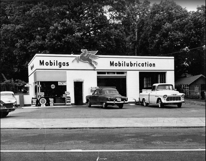
At the corner of Beechwood and Kavanaugh in Little Rock, known as the heart of the Hillcrest Historic District, is a site that has existed as either a service station or an auto repair shop about as far back as people can remember. In 1955 a Magnolia gas station was constructed and the property remained a full-service gas station until 1991. It then became an auto repair shop until the property was sold in 2016. I lived on Kavanaugh Boulevard, about two blocks away from this property, until about 2014. I appreciate auto repair shops and I’m on a first-name basis with the two my family frequents, but to me, this site seemed to have so much more potential for the neighborhood with its prime location. It definitely didn’t seem to be serving the neighborhood at the highest or best use. Twelve parking spots were located along a retaining wall and the entire site was covered in asphalt or concrete, while the raised curb from the two previous pump service stations still protruded from the middle of the site. Along Kavanaugh street frontage, 75% of it was curb cuts for vehicle access and the garage was pulled back to the far wide corner of the pie-shaped lot. On the south side of Kavanaugh, across the street, buildings lined the sidewalks with parallel parking spaces and mature trees, a stark contrast to the old service station across the street. The two sites were the polar opposite ends of what is considered good urban design and community development.
Luckily, Doug Martin, a Hillcrest resident, saw an opportunity to correct this travesty. Knowing that the garage was about to be closed and torn down, he acquired it with a desire to do something positive for the neighborhood. Martin commissioned studies to explore the possibilities of a park-like setting on the corner with an adjoining restaurant housed in the garage. The goal of the project was to maximize green space while minimizing the building footprint.
The construction of Hill Station began in the spring of 2019. The existing service station had later alterations removed, its original features exposed, retained and repaired. An addition, slightly larger than the original building, was constructed to bring the structure to the street and further enhance the strong urban conditions experienced throughout the neighborhood. The massive amounts of existing site paving were removed and replaced with decomposed granite to allow trees, landscaping and casual outdoor seating to comfortably fill a corner once alienated by harsh paving and vehicles. Five large mature lacebark elm trees were relocated to the site from Maryland to further enhance the park-like setting by creating shade to protect the patrons from the harsh western sun.
The original service station houses the kitchen, a soda fountain, restrooms and family-style dining space. The gas station’s original pink and blue tile restrooms were retained, providing just the right amount of context and nostalgia as a nod to the past while fully embracing the future.
The design decisions for the new addition fit within the material legacy of the neighborhood while also taking design cues from the modern design elements of the original service station. The interior of the new addition showcases the facade of the original structure and houses the main dining room and bar, including an overhead door to serve the outdoor bar on the large west porch.
If there was ever a project that deserves to have a garage door that connects space, it’s this one. Other interior features include open roof joists (similar to the original garage), repurposed 1920s v-groove paneling (salvaged from a nearby historic house), linoleum flooring and a combination of table, booth and bar seating. These material choices help accentuate the best aspects of the original building while also tying the entire project together.
The development, design and construction team, including Doug Martin, Daniel Bryant, Tommy Jameson AIA, Tanner Weeks of the Ecological Design Group, and Cline Construction Group, should be commended for creating a project that enhances the neighborhood and truly serves as a hub for Hillcrest. The way they incorporated the existing site, reused the existing building, designed the new addition to fit the historic context while still feeling new and innovative, elevated the outdoor space and made it highly visible, and the extensive lengths they went to creating an environment that is easily relatable and extremely comfortable makes this a successful project. Anyone strolling down Kavanaugh can see the impact this bustling restaurant has had on the neighborhood. It could stand up against similar projects in places like Austin or Nashville. My only regret is that I didn’t get to enjoy this when I lived only two blocks away!
Jonathan Opitz, AIA, is a partner with AMR Architects and the editor of Block, Street & Building.


